Designing Websites for Longer Translated Text
2026.09.15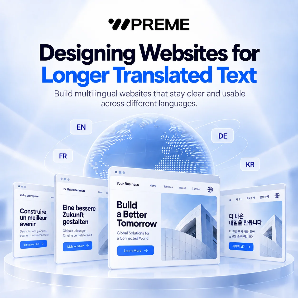
Designing Websites for Longer Translated Text
When a website is translated into another language, the words do not always stay the same length.
A short English button such as “Buy Now” may become significantly longer in German, French, Korean, or another language. A navigation label that fits comfortably in one language may wrap into two lines in another. A headline that occupies two lines in English may suddenly require three or four lines after translation.
This may seem like a small design issue, but it can affect the entire user experience.
Multilingual website design is not simply about replacing one sentence with another. The interface itself must be able to adapt to different languages without breaking layouts, reducing readability, or making the website feel inconsistent.
For businesses planning to serve international users, designing for longer translated text should therefore begin before translation is completed.
Why Translated Text Often Becomes Longer
Different languages communicate information using different sentence structures, grammar systems, and word lengths.
English is often relatively compact in interface design. Many common labels such as “Contact,” “Services,” “Learn More,” or “View Details” fit easily inside small buttons and navigation menus.
However, translated versions may require considerably more space.
For example, a two-word English phrase may become a much longer German expression. French and Spanish translations may also expand because articles, prepositions, and grammatical structures require additional characters.
The opposite can also happen. Some languages may be shorter than English.
The important point is that text length is unpredictable across languages.
If a website is designed with fixed widths and tight spacing based only on the original language, localization can quickly create layout problems.
This is why multilingual UI design should focus on flexibility rather than exact text dimensions.
Avoid Fixed Widths for Important Interface Elements
One of the most common problems in multilingual websites comes from fixed-width components.
Buttons, navigation menus, tabs, cards, and form fields are often designed with precise dimensions.
For example, a designer might create a button that perfectly fits the label:
“Learn More”
Once translated, the button may no longer have enough space.
The result can be text overflow, awkward line breaks, or inconsistent button sizes.
A better approach is to design components that expand naturally.
Buttons should normally use horizontal padding instead of relying on a fixed width. Navigation items should have enough spacing to accommodate longer words. Cards should allow titles to wrap naturally without breaking the visual hierarchy.
Flexible layouts make localization much easier because the interface can respond to content rather than forcing content into a rigid structure.
Design Navigation With Language Expansion in Mind
Navigation is one of the most sensitive areas of multilingual website design.
Desktop menus usually have limited horizontal space.
A navigation bar that works perfectly in English may become crowded when translated into another language.
For example:
Services Solutions Industries Resources Contact
may fit comfortably across a desktop header.
But if each item becomes 30 to 50 percent longer after translation, the navigation may suddenly exceed the available width.
There are several ways to prevent this problem.
First, avoid creating navigation menus with too many items.
A simpler information architecture is easier to translate and easier for users to understand.
Second, leave sufficient spacing between menu items during the initial design process.
Third, consider responsive behavior even on large screens.
If navigation becomes too wide, the interface may need to switch to a condensed menu or alternative structure earlier than expected.
Multilingual websites should not assume that desktop navigation will always remain on a single line.
Headlines Need Flexible Vertical Space
Headlines are another area where translation can dramatically affect layout.
Marketing pages often use large headlines with carefully controlled line breaks.
For example:
“Build Better Digital Experiences”
might appear as two balanced lines in English.
However, a translated version could become much longer.
If the hero section has a fixed height, the additional text may overlap with buttons, images, or other elements.
Designers should therefore avoid treating line breaks as permanent.
Instead, hero sections should allow additional vertical space when needed.
It is also helpful to define a maximum text width rather than forcing specific line breaks.
The typography should respond naturally to the available space.
For multilingual websites, the goal is not to make every language look exactly identical.
The goal is to maintain the same visual hierarchy and usability even when the content length changes.
Buttons Should Prioritize Meaning Over Uniform Size
Many websites attempt to make every button exactly the same width.
This can create problems in localized interfaces.
A short English CTA such as:
“Start”
may become:
“Start Your Consultation”
or an equivalent longer phrase in another language.
If the design forces every button into a narrow fixed container, the translated version may look crowded or require smaller typography.
Reducing font size is usually the wrong solution.
Readable text should remain readable.
Instead, allow button widths to expand based on the label.
If multiple buttons appear next to each other, their layout should also be able to stack vertically on smaller screens.
This is especially important because translation expansion and responsive layouts often interact.
A button that fits on desktop may still become difficult to use on mobile.
Cards and Content Modules Need Flexible Heights
Modern websites often use card-based layouts.
Cards may contain icons, headings, descriptions, prices, or feature lists.
Designers sometimes make all cards the same height for visual consistency.
This works well until translated content becomes longer.
One card might require three lines of text while another requires five.
If the content area is fixed, the text may overflow or become compressed.
There are two common approaches.
The first is allowing card heights to expand based on content.
The second is designing the card with enough flexible internal space so moderate translation differences can be absorbed without changing the layout significantly.
What matters most is avoiding situations where text is hidden, clipped, or artificially shortened simply to preserve the original design.
Content should guide the layout.
The layout should not restrict the content.
Test the Interface With Expansion Text
Waiting until the translation is finished before testing the layout can create unnecessary redesign work.
A useful technique is to test the interface with expansion text during the design phase.
Designers can intentionally increase the length of sample text by approximately 30 to 50 percent.
For example:
“Contact Us”
could temporarily become something like:
“Contact Our Team Today”
The exact wording is not important.
The purpose is to simulate how the interface behaves when text becomes longer.
This can quickly reveal weaknesses in buttons, navigation bars, cards, headlines, and forms.
It is much easier to solve these issues during the design process than after every translated page has already been created.
Typography Also Changes Across Languages
Text length is not the only challenge.
Different languages may require different fonts.
A font used for English may not support Korean, Japanese, Arabic, or other writing systems.
When a fallback font is used, character width and line height can change significantly.
This can affect the entire layout.
For example, a Korean font may have different vertical proportions compared with the original Latin font.
Line spacing that looked comfortable in English may appear too tight.
Font weight can also appear visually different.
Multilingual websites should therefore define typography systems for each supported script.
Font selection should consider:
- readability
- character coverage
- line height
- font weight
- loading performance
- consistency across devices
Typography should be tested in real languages rather than relying only on placeholder text.
Do Not Translate the Layout Literally
Localization works best when the design allows small differences between languages.
Trying to force every translated version to match the original layout exactly can create unnecessary problems.
For example, an English headline may be short enough to appear on one line.
The German version may naturally require two lines.
That is not necessarily a design failure.
If the spacing and hierarchy still look intentional, the interface is working correctly.
The goal of localization is not visual duplication.
It is functional consistency.
Users should receive the same information, understand the same hierarchy, and complete the same actions regardless of language.
Allowing the layout to adjust slightly is often better than aggressively shrinking text or removing important content.
Multilingual Design Should Be Part of the Original Website Strategy
Many localization problems happen because multilingual support is added after the website has already been designed.
The original interface may have been created specifically for one language.
Every button, card, navigation item, and headline may have been optimized around that content.
When translation begins, the design suddenly has to support situations it was never built for.
A better approach is to consider international expansion from the beginning.
Even if a website launches initially in only one language, flexible components make future localization much easier.
This includes using responsive containers, adaptable typography, scalable navigation, flexible cards, and reusable design systems.
A multilingual website becomes much easier to maintain when localization requirements are built into the design system itself.
Final Thoughts
Longer translated text is not just a translation issue.
It is a website design issue.
Navigation, buttons, headlines, cards, forms, and typography all need enough flexibility to support different languages.
The most effective multilingual websites are not designed around one specific set of sentences.
They are designed around adaptable content structures.
By planning for text expansion, testing multiple languages early, and avoiding rigid layouts, businesses can create websites that remain clear, consistent, and usable across international markets.
For companies preparing to expand globally, this flexibility can significantly reduce redesign work later while providing a more professional experience for users in every supported language.