Why Good UI Needs Repetition
2026.08.14
Why Good UI Needs Repetition
UI DESIGN · CONSISTENCY · DESIGN SYSTEM
When designing a website, it can be tempting to make every section feel different. A new card style here, a different button there, or a completely new layout on the next page can make the design feel more creative during the production process.
But for users, constantly changing UI patterns creates more work.
Good UI relies on repetition because repeated patterns help users understand how a website works. Once visitors recognize a button, card, navigation pattern, or content structure, they should not have to learn it again somewhere else.
Repetition is not about making every section identical. It is about creating predictable rules and applying them consistently.
UI PRINCIPLE
01. Repetition Helps Users Learn the Interface
Users begin learning a website almost immediately.
If a blue filled button represents the primary action on the first screen, users gradually associate that visual style with an important action. When the same button appears later, they already understand what it means.
The same principle applies to navigation, forms, cards, icons, headings, and interactive elements.
When similar actions look and behave consistently, users can focus on the content rather than trying to understand the interface again.
This becomes even more important on larger websites. A visitor may move between a service page, case study, company profile, and contact page during the same session. Consistent UI patterns make those different pages feel like parts of the same system.
> WEBPREME INSIGHT > A familiar interface requires less explanation. Repetition allows users to understand new pages using patterns they have already learned.
VISUAL CONSISTENCY
02. Consistency Reduces Visual Noise

Repetition also affects how clean a website feels.
Imagine a website where one section uses rounded cards, another uses sharp borders, another introduces a completely different shadow style, and every CTA has a different shape.
Each element might look good individually, but together they create unnecessary visual noise.
A more consistent UI establishes rules.
Primary buttons follow one style. Secondary actions follow another. Headings use predictable typography. Cards share spacing principles. Icons maintain similar proportions and visual weight.
This does not necessarily make the website simpler in terms of content. Instead, it makes the interface easier to process.
Users can quickly distinguish between what is new information and what is simply part of the interface.
DESIGN BALANCE
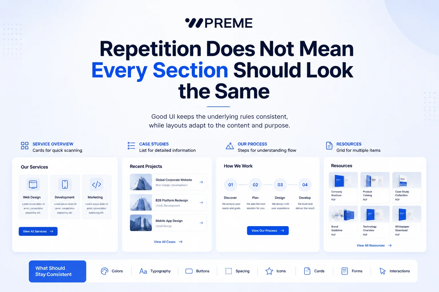
03. Repetition Does Not Mean Every Section Should Look the Same
This is where repetition is often misunderstood.
Consistency does not mean copying the same three-column card layout throughout an entire website.
A service overview might work well with cards, while a technical process may be clearer as a timeline. A portfolio may need large imagery, while a comparison section may work better with structured columns.
The layout can change according to the content.
What should remain consistent are the underlying UI rules.
Button styles, typography hierarchy, spacing, border treatments, form controls, icon styles, and interaction patterns should still feel connected.
This balance allows designers to introduce visual variation without making each section feel like it belongs to a different website.
A useful question during design review is not:
“Does this section look different enough?”
Instead, ask:
“Does this section need a different structure to communicate the content better?”
That distinction prevents unnecessary design variation.
PRACTICAL GUIDE
04. Build UI Rules Before Designing More Pages
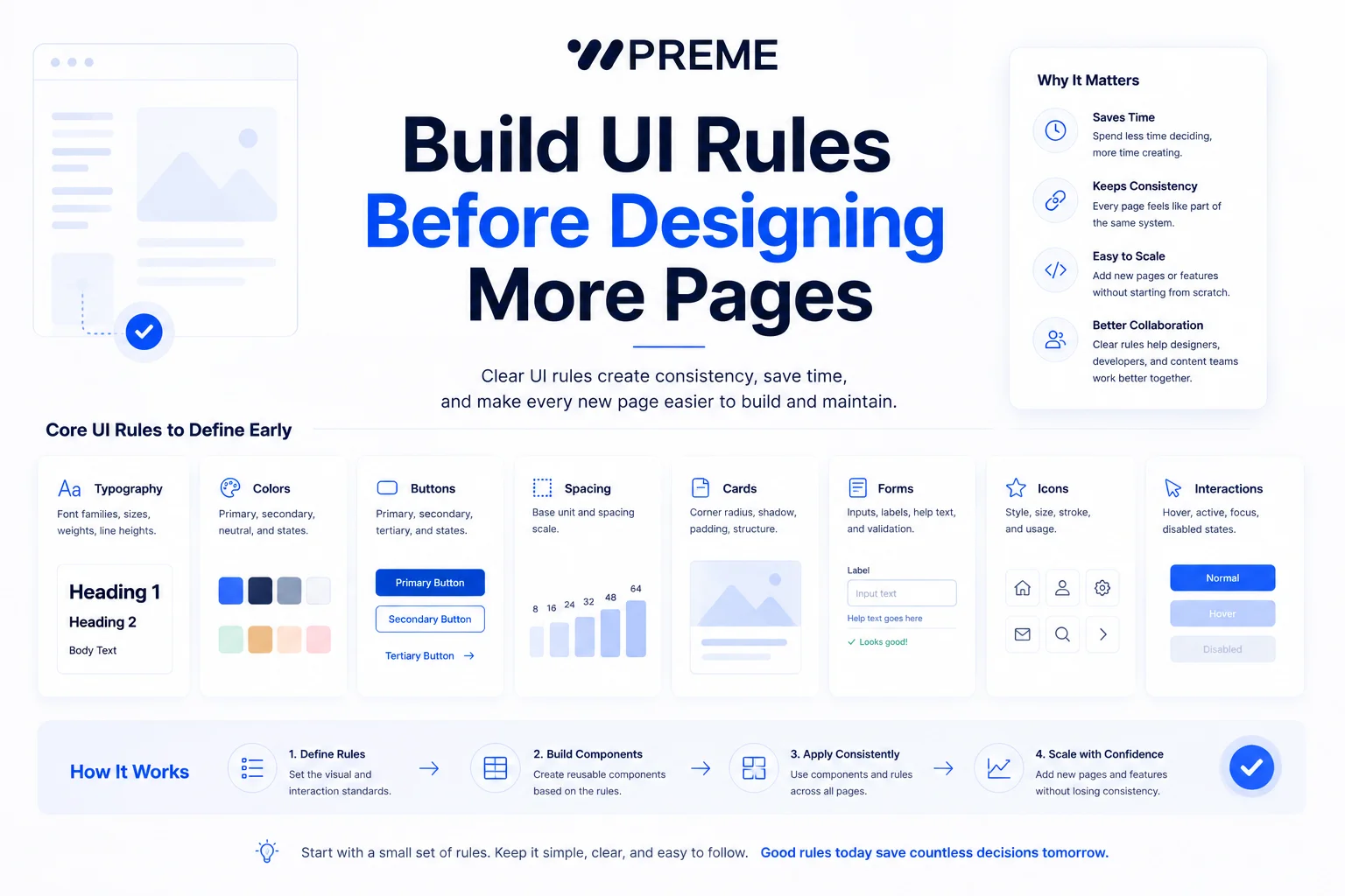
Consistency becomes harder to maintain as a website grows.
A five-page website may be manageable without a formal system. But once more service pages, landing pages, case studies, forms, and content sections are added, small inconsistencies begin to accumulate.
This is why basic UI rules should be established early.
A practical starting point includes:
- Typography hierarchy
- Primary and secondary buttons
- Spacing intervals
- Content widths
- Card styles
- Form elements
- Icon rules
- Border and radius values
- Common interactive states
These rules do not need to become a complicated design system.
Even a small set of clearly defined components can prevent designers and developers from making a new decision every time another page is created.
It also makes future updates easier. When a primary button or spacing rule changes, the team already knows where that rule should apply.
FINAL NOTE
Consistency Creates Familiarity
Good website UI is not created by introducing a new visual idea in every section.
The strongest interfaces usually have a recognizable design language that continues across different pages and different types of content.
Repetition helps users learn that language.
Designers can still change layouts, compositions, imagery, and content presentation when the information requires it. The important part is knowing which elements should change and which rules should remain familiar.
A website can have variety without losing consistency.
That is where repetition becomes more than a visual choice. It becomes part of how the interface communicates.