International Users Usually Expect Mobile Clarity First
2026.05.15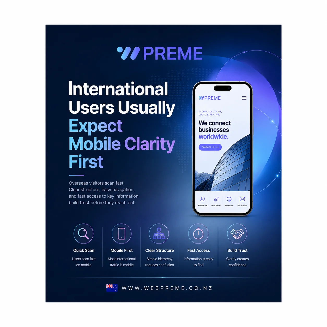
International Users Usually Expect Mobile Clarity First
When businesses prepare an international website, many still focus heavily on translation, visuals, or branding first.
Those things are important.
However, one of the biggest differences in international markets is how quickly users judge the website itself — especially on mobile.
In many cases, overseas visitors do not spend much time carefully reading every section.
They scan.
They compare.
They move quickly.
And increasingly, that entire process starts on mobile devices.
This is why mobile clarity has become far more important than many businesses initially expect.
Today, international users often encounter websites through mobile search results, social media links, directories, email campaigns, or online advertisements before they ever visit a desktop version.
That means the first impression of the business is increasingly shaped by a smaller screen.
For many companies, this changes everything about how the website needs to communicate.
International visitors often judge the business before reading deeply
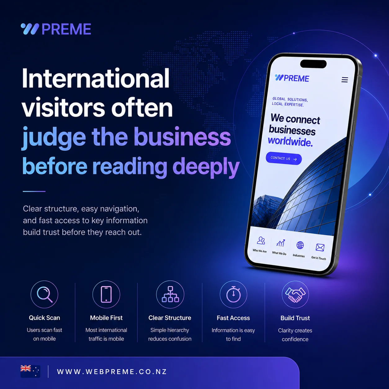
Many international users try to understand the business structure first.
What does the company actually do?
Can they handle international communication?
Does the business look operationally stable?
Is the information organised clearly?
Can users quickly find what they need?
If these answers are not immediately visible, users often leave before reading further.
Interestingly, this problem appears even on websites that visually look modern.
A website may contain impressive animations, polished graphics, and high-end branding.
However, if the information flow feels difficult on mobile, the overall impression becomes weaker very quickly.
This is especially noticeable for B2B companies, manufacturers, agencies, logistics businesses, industrial suppliers, and service providers where trust and clarity matter heavily during the first few seconds.
In many overseas markets, users often compare multiple businesses very quickly before making contact.
They may open several websites at once.
They may review suppliers while working.
They may not fully understand the language.
They may also be unfamiliar with the business itself.
Because of this, users usually rely heavily on structure and clarity to determine whether the company feels trustworthy.
This is why international website UX often depends more on information organisation than many businesses initially expect.
Mobile environments also change how users consume information.
Desktop users often have more patience.
Mobile users usually do not.
International mobile visitors tend to scan rapidly while comparing multiple businesses at once.
That changes how information should be organised.
For example, users often expect to understand these things immediately:
Mobile User Expectations Why It Matters What the business does Reduces confusion quickly Main services or products Helps comparison speed Contact or inquiry access Improves conversion flow Company credibility Builds trust faster Clear structure and navigation Reduces fatigue
If users struggle to locate these elements quickly, mobile bounce rates often increase significantly.
This is also why many international websites feel “difficult” even when the design itself looks clean.
The issue is often not the visual quality.
The issue is usually information prioritisation.
Some websites simply try to show too many things at once.
Too many banners.
Too many sections.
Too many animations.
Too many layered menus.
Too much text before users understand the core message.
On desktop these issues may feel manageable.
On mobile they often become overwhelming very quickly.
Too much content often creates more friction on mobile
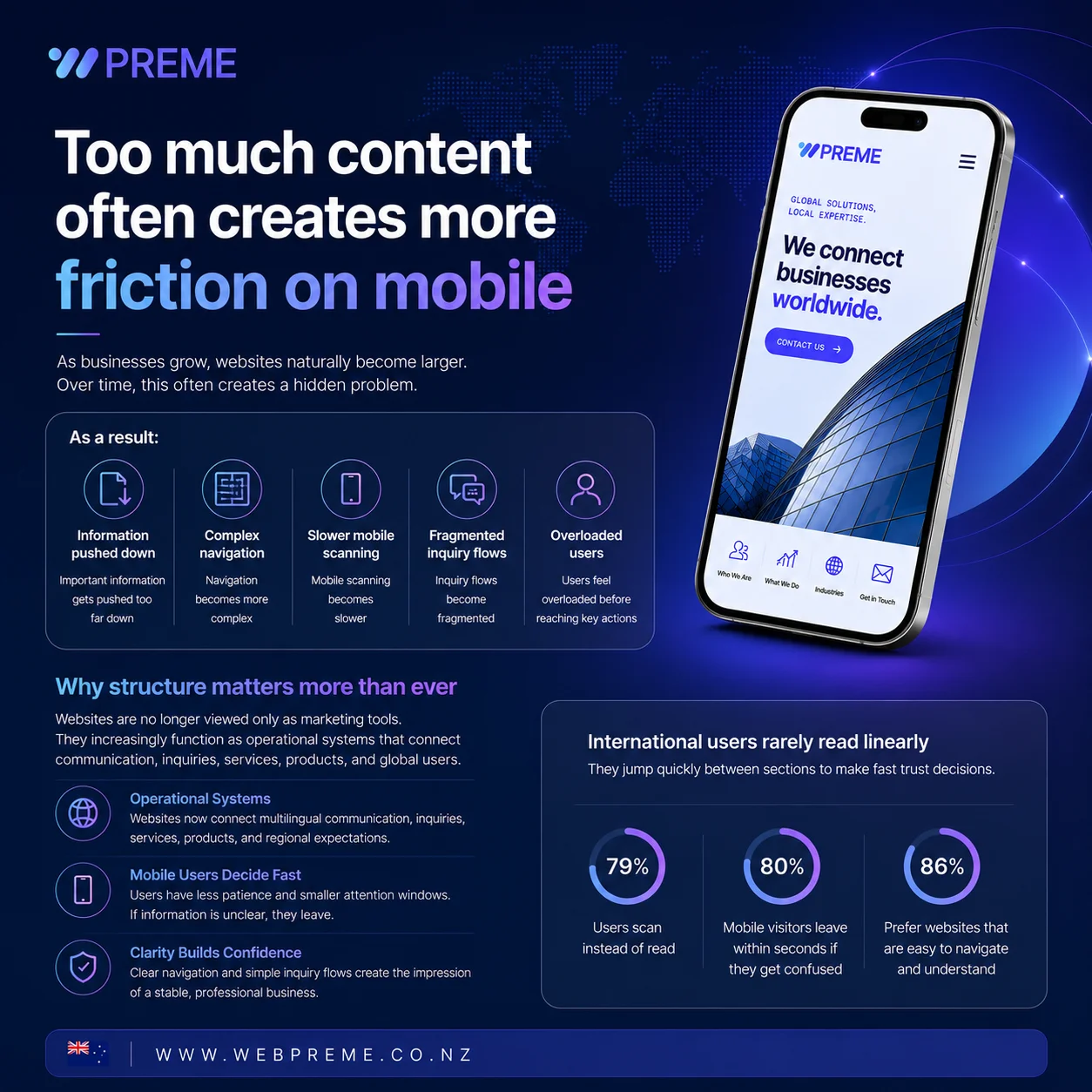
As businesses grow, websites naturally become larger.
More pages.
More services.
More case studies.
More updates.
More product categories.
More operational details.
Over time, this often creates a hidden problem.
The website becomes harder to navigate on mobile.
Many companies continue adding information without reorganising the structure around how users actually move through the website.
As a result:
Important information gets pushed too far down Navigation becomes more complex Mobile scanning becomes slower Inquiry flows become fragmented Users feel overloaded before reaching key actions
This is why many international websites eventually require structural reorganisation rather than visual redesign alone.
Especially in mobile environments, users rarely consume information linearly.
They jump quickly between sections while trying to make fast trust decisions.
One important shift happening globally is that websites are no longer viewed only as marketing tools.
They increasingly function as operational systems.
Especially for international businesses, websites often connect directly with multilingual communication, inquiry management, service explanation, product organisation, regional customer expectations, and mobile-first user behaviour.
Because of this, businesses are starting to prioritise usability and clarity much more seriously.
A visually impressive website may still perform poorly if users cannot quickly understand how the business operates.
This becomes even more important on mobile because users have less patience and smaller attention windows.
Many businesses also underestimate how much mobile structure affects perceived professionalism.
For example, unclear navigation or slow information access often creates the impression that the business itself may also be difficult to work with.
On the other hand, when information is organised clearly and the inquiry flow feels simple, users often assume the company itself is more stable and experienced.
That psychological connection is becoming stronger in international markets.
Simpler mobile experiences often perform better internationally
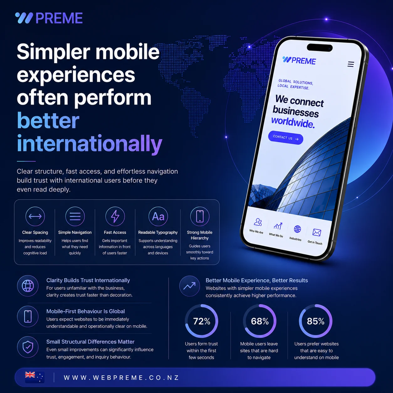
Many businesses assume international websites need more visual complexity to appear premium.
In reality, overly complex layouts often reduce usability.
Clear spacing.
Simple navigation.
Fast information access.
Readable typography.
Strong mobile hierarchy.
These elements usually create a more stable international user experience than visually overloaded designs.
Especially for overseas users unfamiliar with the business, clarity often creates trust faster than decoration.
This is why many global websites today are moving toward cleaner structures and simpler mobile experiences rather than heavily layered interfaces.
International users increasingly expect websites to feel immediately understandable on mobile.
Not just visually attractive.
Operationally clear.
As mobile-first behaviour continues growing globally, businesses are beginning to realise that even small structural differences can heavily influence user trust and inquiry behaviour.
In many cases, users decide whether the company feels reliable long before they finish reading the website itself.
And increasingly, that judgment happens entirely through mobile experience.